MY UX

Process

Human Centered Design

Here are some of the things in my wheelhouse. When consulting, I always say, no two projects are alike, but a combination of these UX practices will get you to success.

Phase 1: Discovery

User Interviews
Stakeholder Interviews
Data Analysis
Competitive Landscape

Phase 2: Synthesis & Ideation

Insights
Opportunities
Brainstorms & Workshops
Archetypes
Journey Maps

Phase 3: Design

Wireframes
Information Architecture
UI
Meaningful Motion
Prototypes

Phase 4: Test & Iterate

Validation Testing
Product Roadmap Analysis
Click Through Analysis

Phase 1: Discovery

User Interviews

The crux of human centered design is listening to your users. I design qualitative in-context interviews to gain a deep understanding of the prospective or current user base’s pain points. Separate from usability tests, this process is about discovering the latent user problems and frustrations, not testing solutions.


Stakeholder Interviews

Understanding the decison-makers' process, biases, fears, and wishes is just as important as those of the customer. Interviews within an organization are critical to moving initiatives forward. When possible and necessary I hold conversations with the stakeholders for a design project, inquiring about their definition of risk and success with the current statement of work.

Competitive Landscape

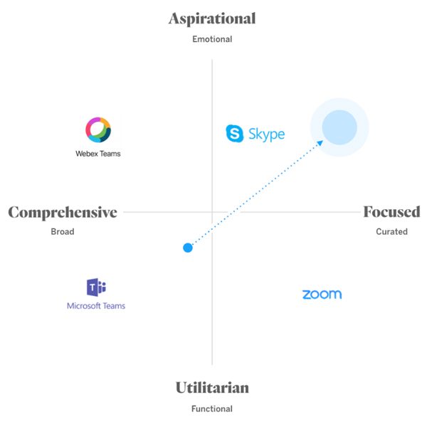
Understanding the competition. from a design and aesthetics perspective. from a strategy perspective. a storytelling perspective.

Phase 2: Synthesis & Ideation

Insights

Synthesizing the user needs learned about in research, we find patterns in user behavior, motivation, and emotional triggers. From these patterns, we can articulate how a new product can have a differentiated user experience by meeting these needs, by empathizing with these behaviors, and by triggering positive emotions.


Opportunities

From Insights, we create Opportunity. ‘How might we’ statements allow us to generate ideas within the correct context, answering the right questions. Opportunity Areas show where a product can differentiate, and find a product market fit.


Brainstorms & Workshops

I thoroughly enjoy guiding all kinds of workshops with all kinds of teams, from Sprint methodology, to creative ideation, to team building. There's never a bad time to take a step back (or sideways) and attack a problem in a fun group setting.


Archetypes / Personas

Segmentation of users by their behavior and motiovation, helps us efficiently solve for large groups and further undesrtand our users.


Journey Maps

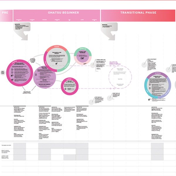
Journey Maps are one artifact from user interviews. It shows the design and development team where the most significant interception points are in a user’s daily life. It shows the ‘moments that matter’ and the emotional highs and lows. Furthermore, they align the design and development team.

Phase 3: Design

Wireframes

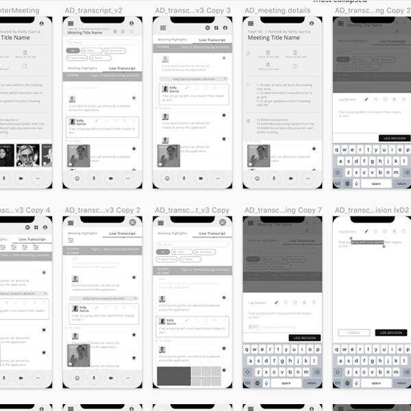
Wireframing is essential to determining the right flow for digital products. I practice many levels of wireframing from hand-drawn interfaces quickly linked together in Invsion, to robust greyscale animated interfaces that can take a user through an entire flow. Wireframes can quickly validate feature ideas, UX logic, and user needs.


Information Architecture

Information Architecture maps are a necessary artifact to align teams on content and functionality of digital products. They’re extremely useful for roadmapping and facilitating conversations around features and components of the UI.


UI Touchpoints

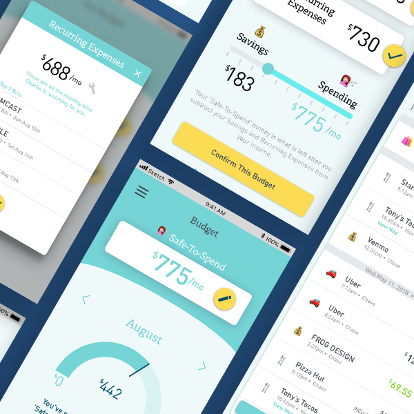
Wether it’s mobile, desktop, tablet, watch, voice UI, NUI, VR, AR, or a combination of all of them – the process of designing the UI/UX of the product holds the same goal of keeping the designs clean, clear, and human-centered. Interface design can be done by leveraging a client’s existing DLS (design language system) or by creating one from scratch. I strive for perfection and clarity in every screen design and flow diagram. Deliverables can include final UI design, wireframe flows, or information architecture maps.

Meaningful Motion

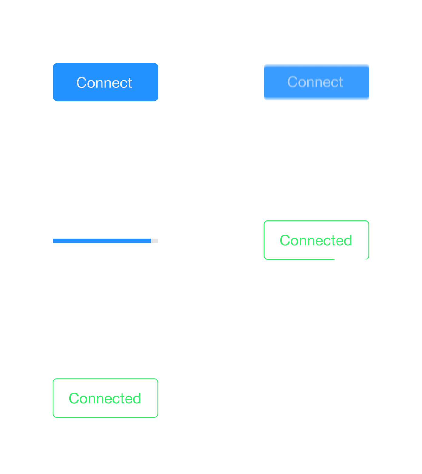
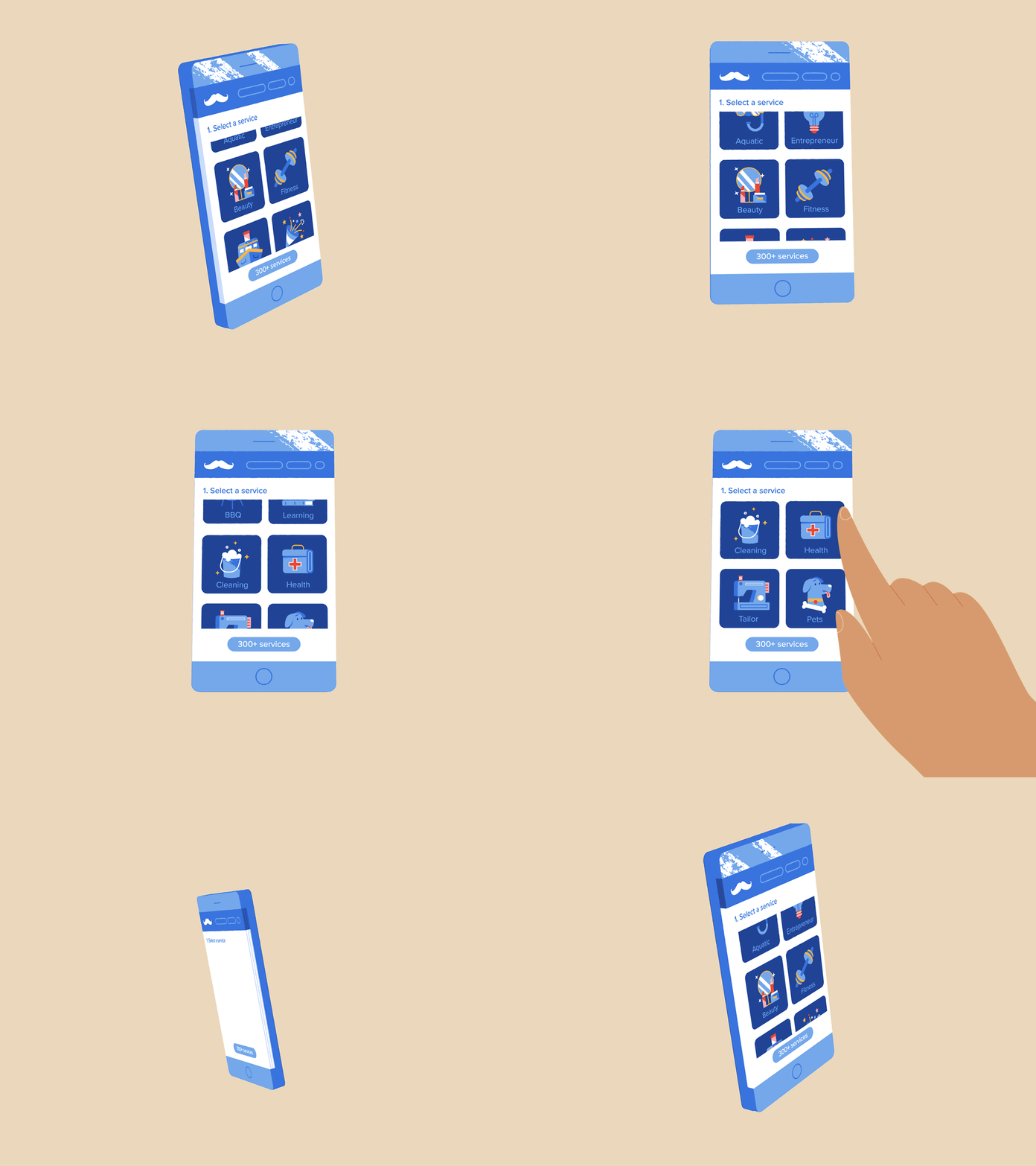
Motion is meaning, especially in the current wave of flat, simple interfaces. Motion is used internally and externally to convey meaning -- both to the development team and to the user. Animated prototypes, using tools such as AfterEffects, InVision, or Principle can do 4 things: spark internal dialogue, convey interface functionality, convey the structure of a design system, and create emotional resonance with users. Image courtsey of Nimrodado.


Prototype

Depending on the need, prototype fidelity can be built on a spectrum from hand drawn wireframes, to a straw-man clickable prototype, all the way to a fully interactive MVP. The goal is to decide what you want to test and then create the most efficient way to test that with the least amount of noise/variables so you can confidently interpret the results.

Phase 4: Test & Iterate

Validation Testing

You can't manage what you don't measure. Vaildation testing is essential to understand both superficial interface problems and usability flow problems. We also use tests to understand user's motivations surrounding new features, or workarounds that they have developed. I love connecting with real users and listening to them. Image courtesy of Daniel Destefanis.


Roadmap Prioritization

How should we decide what to work on next? How long will it take? How will we know if it's succesful? Roadmapping helps drive team consensus. Once a team has enough data to create a roadmap, we use an agile methodology to create a timeline.


Click Through Analysis

It's important to find signal through the noise. I work with engineers to interpret analytics and validate quantatative analysis with qualitative. I remind my teams that Quant can tell us 'what,' but not 'why'. Image courtsey of Dinos&Teacups.