We knew that the number one reason users leave us for the competition was for lack of a mobile app. But beyond that, we had little detail into the expectations and robustness of the mobile feature set. So we went digging. We did a thorough competitive analysis and then an investigation of our own features. We mapped out a plan to build an MVP that we could test iteratively with users. Then we put together some rough criteria for alpha, beta, and an app store launch.
Looking at the webapp, we decided early on that our guiding principle was to maintain the interaction model from web, within mobile. Leveraging expected mobile affordances and interactions only made this model more user friendly. We also decided that we would create one experience for iOS and Android, that might blend some of the native affordances of both platforms. For example, Apple's bottom tab nav, or Android's floating buttons.
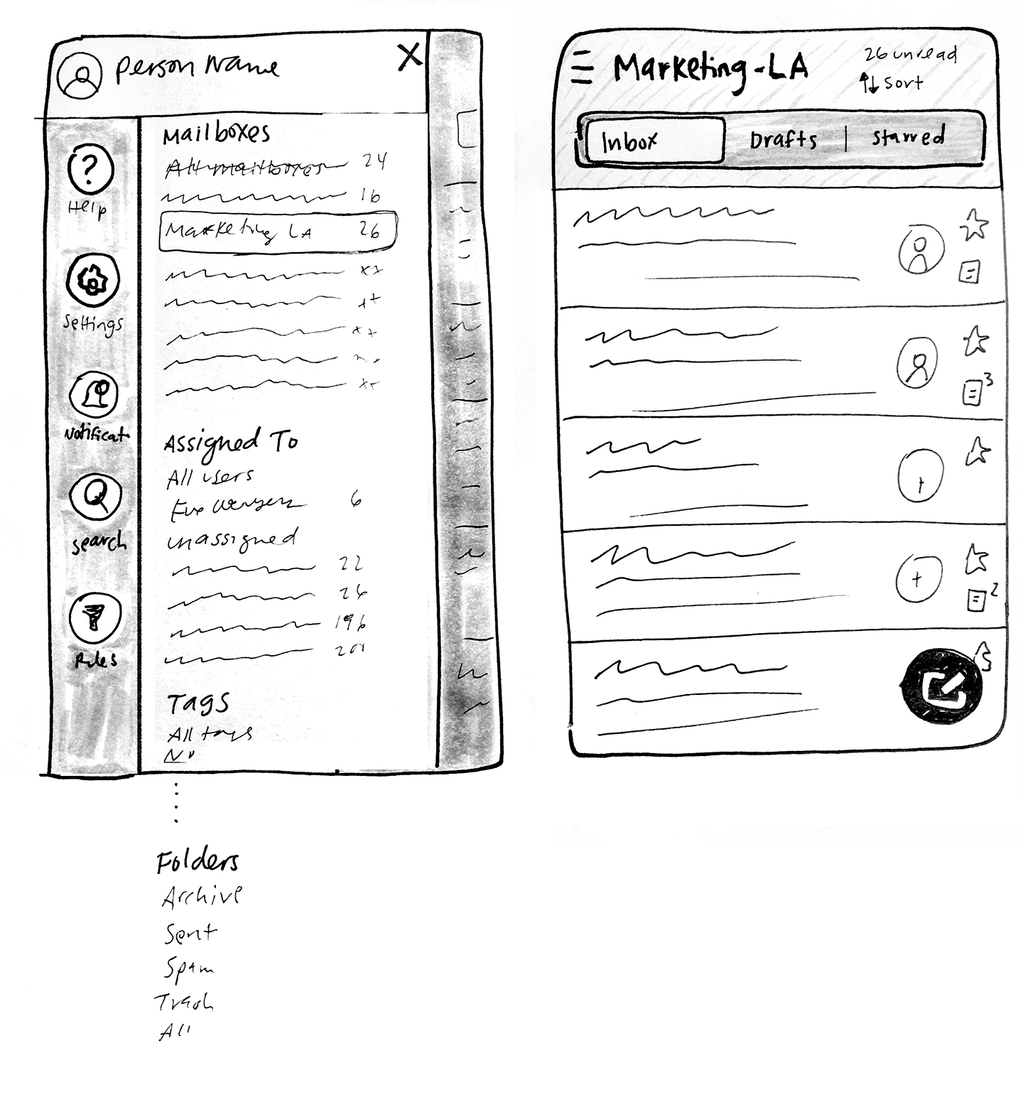
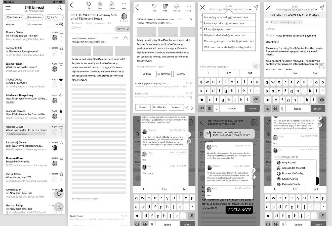
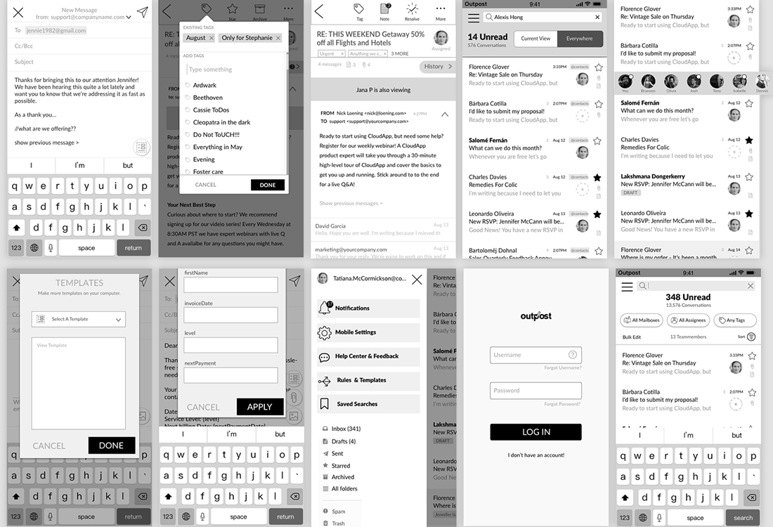
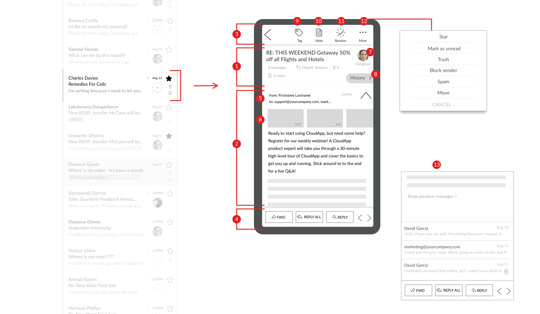
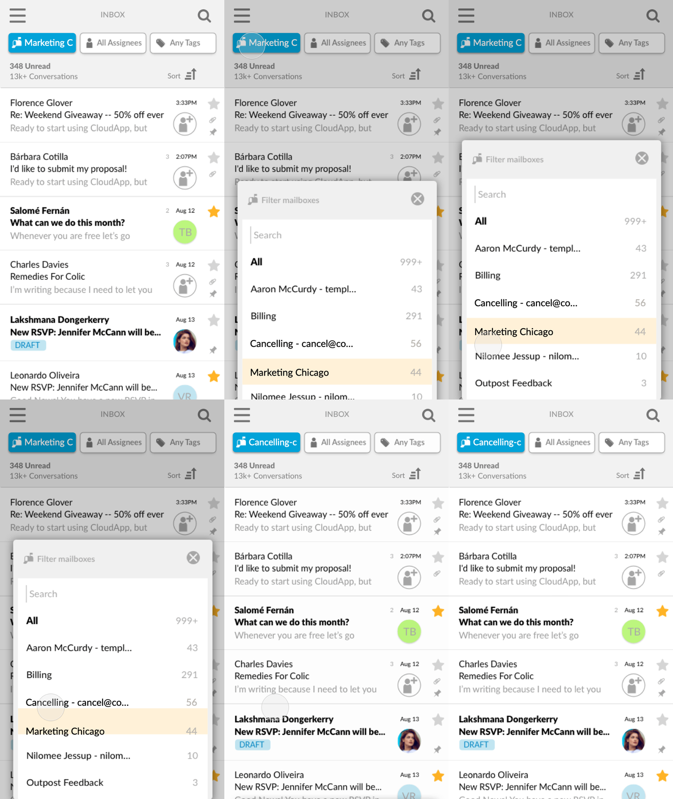
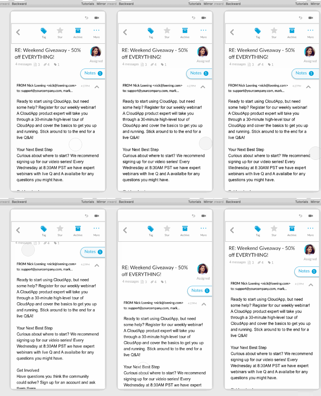
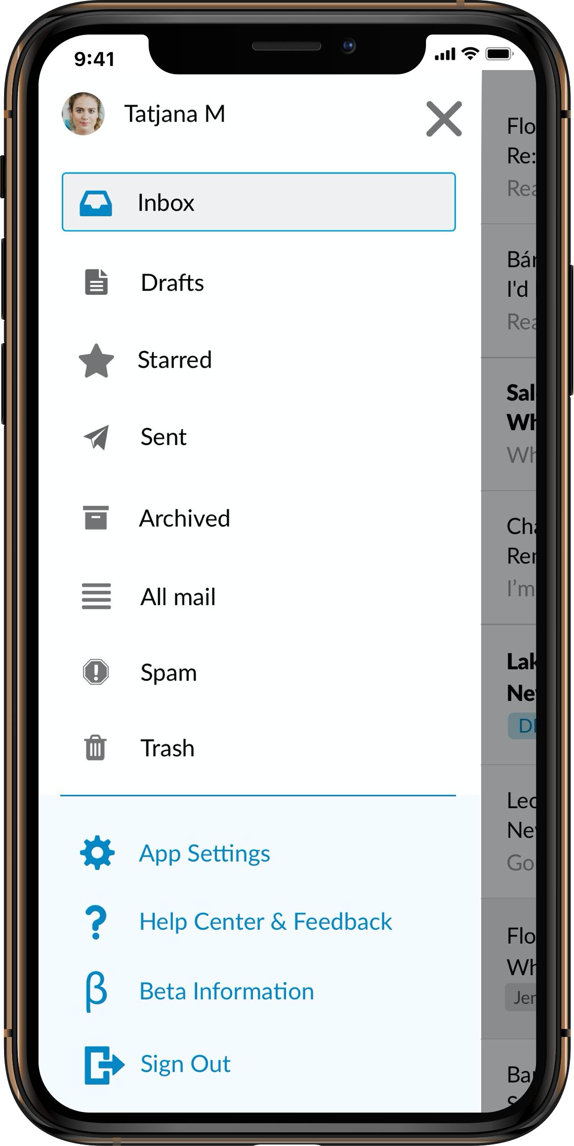
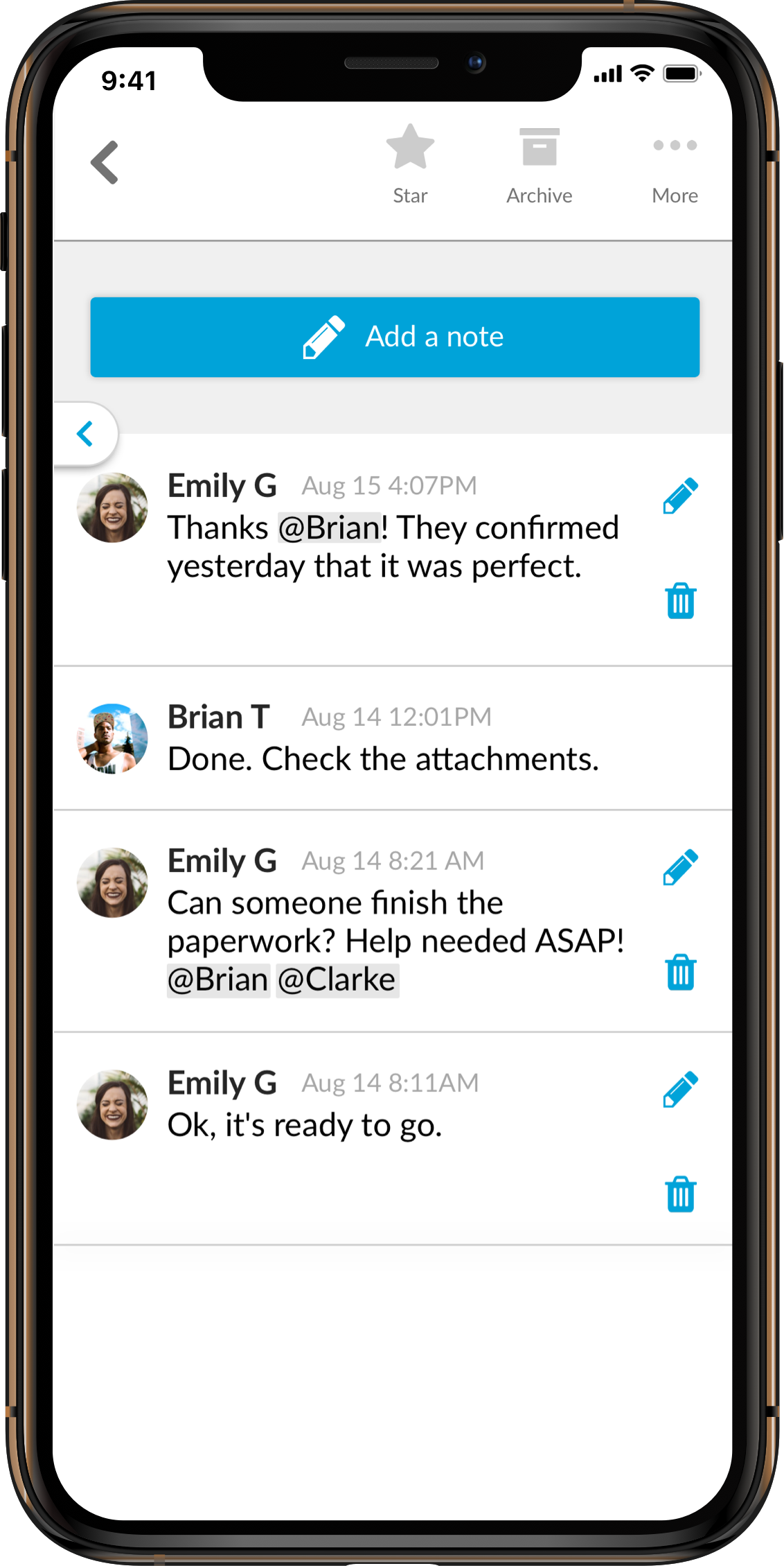
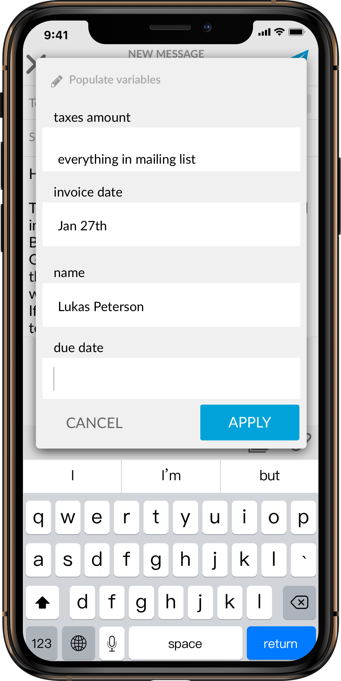
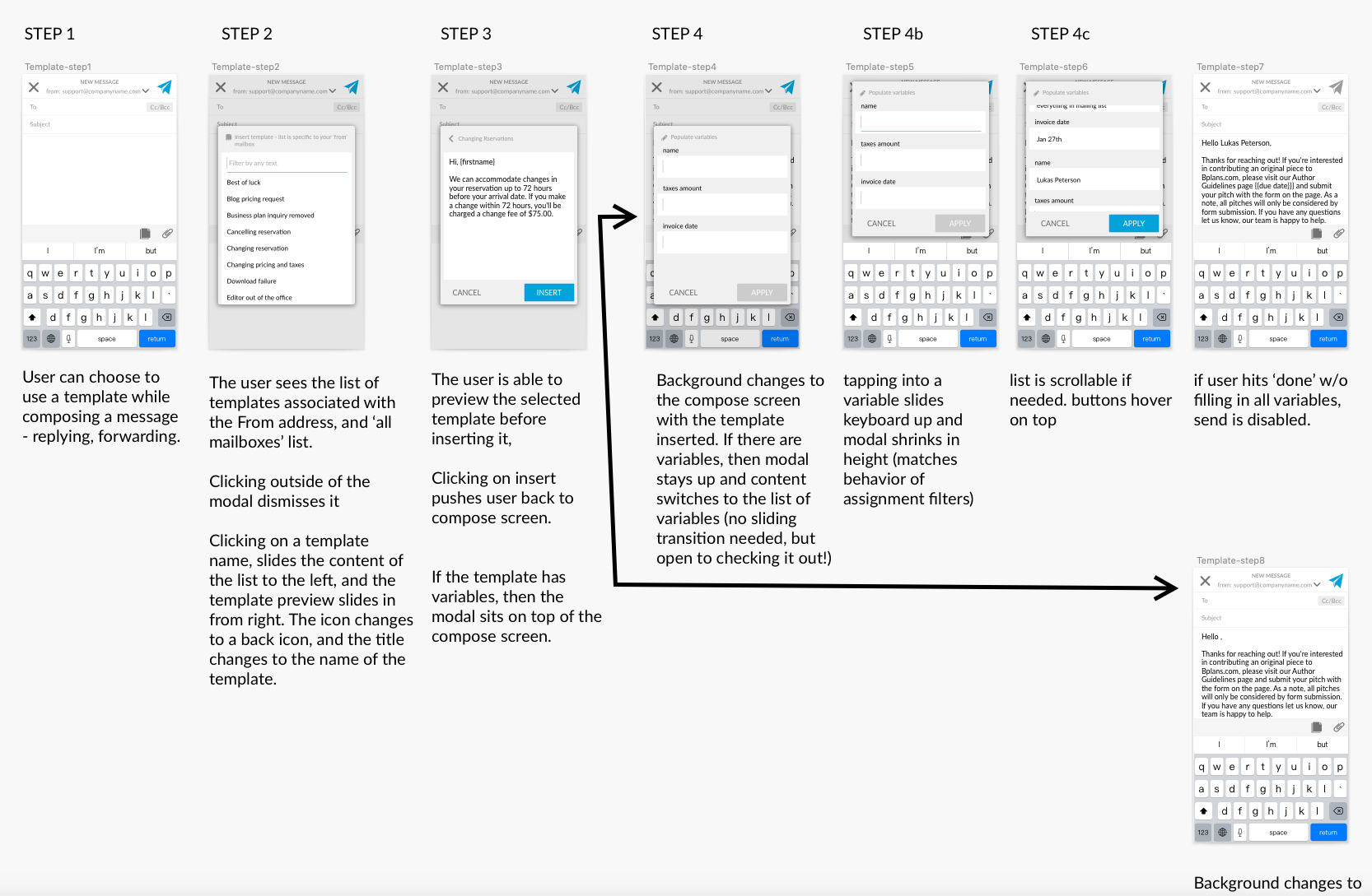
It's so hard to capture the hundreds of wireframes that get created, but here are a few.
We used these wireframes to align as a team, but also to conduct usability tests. I created a 30 minute script that we were able to run through with internal stakeholders, and external users. We refined the layout, UX, and UI iteratively until we had confidence.
We moved forward with iOS first, starting an internal alpha, then inviting customers and trial users to a beta, and finally an Apple app store launch. During beta, I worked closely with Marketing and Sales to create a buzz and launch plan for both public beta, app store, and android play store.